In The Press: Carol-Anne discusses Pantone Colour of The Year...
Carol-Anne Leyden, founder of CA Design chats to the Sunday Business Post about how to make Pantone’s 2021 colours work in your space….
As 2020 ended, the Pantone Color Institute announced its colour(s) of the year for 2021: Pantone 17-5104 Ultimate Grey and Pantone 13-0647 Illuminating Yellow. Selecting two colours for only the second time in 22 years, Pantone described the chosen yellow and grey as independent but complementary, representing a theme of unity and mutual support. The beauty of having two colours means you can experiment with the pairing, and really tailor them to suit your tastes.
The last time Pantone decided on more than one colour was in 2016, when it chose Serenity, a light blue, and Rose Quartz, a delicate rosy pink. This year’s vivacious yellow tone was chosen in the hope of it being a “pick-me-up” colour for the new year ahead. The prospect of a new year brings hope, light, and promise, so this colour choice seems particularly fitting if 2020 is anything to go by.
Ultimate Grey does what it says on the tin – a firm, dependable grey tone, presumably representing a constant in an ever-changing and evolving world. Whether you lean towards a yellow room with grey accents throughout, or an overwhelming grey colour scheme with pops of yellow, you really can make this colour palette your own.
Yellow and grey harmonise together to create the ideal combination to give your space a much-needed yet subtle boost of cheer, as we look forward to spring, and the brighter days that come with it. The marriage of these colours represents strength, optimism, and fortitude, following a markedly challenging year. Combining playfulness and calm, the palette can be introduced and weaved into your space simply and effectively as tones of grey form the base of so many already existing interiors.
Pantone colours with furniture: I suggest using the Ultimate Grey as the prominent colour in furnishings,
due to its subtlety. This can be done through accent chairs, walls, and larger furniture. Grey is an extremely versatile colour, and forms the ideal base for adding pops of colour. Adding an accent chair in a grey shade is a simple way to create a base for brighter coloured accessories. Our Saarinen Style Womb Chair and Ottoman in deep grey velvet is an example of an excellent anchor piece that is both practical and extremely comfortable. An instant mood booster, the cheerful ‘Illuminating’ yellow can be incorporated through smaller furniture pieces such as side tables or lampshades and ceiling pendants and lifts the grey elements in the room.
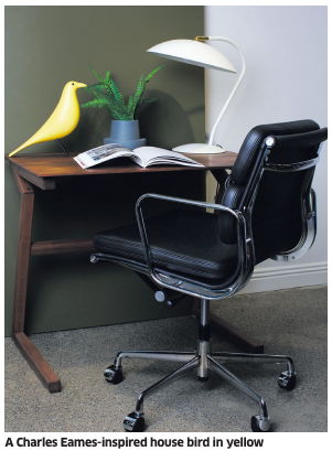
Pantone colours with home accessories: Incorporating the more daring yellow shade in smaller items such as decorative objects, throws and cushions into your interiors is an ideal way to add colour, inject some personality and that all-important finishing touch. Eye-catching objects, such as an unusual vase or an ornament like our Eames-style house bird in yellow, are another easy way to weave in a brighter colour. Where possible, purchase classic and practical pieces that will stand the test of time as well as brightening up your home.
At CA Design, we also recommend coffee-table books to add a pop of colour (yellow can work well here) to your living space: it is the perfect way to subtly incorporate a trend into your existing scheme. Assouline does a great range, and we particularly love their bright yellow ‘Miami’ edition, which screams sunshine and warmth.
Interesting tables and lamps are another great way of incorporating colour and ambience into your home, as well as being practical. Lamps and good lighting in general help to create a lovely atmosphere in a room. Interior design is all about exploring and exposing your creative space. If 2021 taught us anything, it was that life is to be enjoyed, so have fun and step outside the box.


